


background
My collaborative partner Paola and I are somewhat wine enthusiasts, the vast world of wine interests us. We had agreed in conversation that generally, people often aren’t sure where to start when starting their journey with wine. So we began our own journey with creating an app that allows anyone to get information about wine from bite size tips to the history of a specific kind of wine. We also looked into possibly having a subscription service that ships users wine and other food items that pair best with it. We hoped that we could be the Winebud for people wanting to learn.
roles
Ally: UX/UI Designer, Prototyping, User Research
Paola: UX/UI Designer, Prototyping, User Research
objectives
Our objectives on this project were simple, we wanted to provide a space for new and amateur wine drinkers who wish to learn more about wine in an easy and efficient way.
scope
3 Weeks

user interviews
Starting with our user interviews, we needed to see how knowledgable our potential users would be starting out. Paola created a survey to send out and we both worked on our interview plan for our in person interviews. From our interviews and from information we received in the surveys, we found that surprisingly almost 80% of our users purchase wine from grocery stores far more than any liquor store or winery. Their biggest pain points also include:
Inaccurate Labels
Most bottles will include a taste description. Somewhere along the lines of “ Bright, Lively, Crisp, with Fruity Delicate Notes”. It’s always some variation of this, but is it really all of that? Our interviewees consistently agreed that they wished labels more accurately explained the flavor of the wine.
competitor analysis
Discovering New Wines
Our users stated that they have a difficult time discovering new wines. It seems like the only times they really purchase wines is when a friend recommends a specific wine to them. Even with that, everyone’s preferences are so different it’s tough also finding something they can actually enjoy.
Not Knowing Enough
We asked our users how they generally feel when the conversation of wine comes up at a get together and they all responded similarly. They’re not comfortable really speaking about what they don’t know a whole lot about. Not everyone understands how to even properly drink wine.
We continued our research with seeing who our competitors would be. Starting with our first direct competitor Good Pair Days, they are a monthly subscription service that sends subscribers boxes of wine they feel like would most accurately match their taste profile. Initially this site has users take a full questionnaire, and although the graphics are visually very attractive, overall prices are steep for these boxes so it would definitely be a luxury item to have every month.
Untappd, although they are an indirect competitor due to them focusing on beer it is in a lot of ways something similar to what we were wanting to do with WineBuds. They allow users to share their beer findings through the app with their friends and through social media, it also allows them to save and rate the beers they have tried. It’s a lot more interactive in that way, but from users that have used it for years, they state that the app has not been updated in several years. Although it was a great idea at first, Untappd’s design now feels outdated with bugs and glitches.

Problem Statement
Storyboard
User Flow
Winebuds was designed to provide easily accessible information for amateur wine enthusiasts. We have observed that most wine customers are stumped on where to start their journey; which is causing these enthusiasts to feel overwhelmed and directionless.
If providing a direction is our users' need, how might we give clear information about wine while also helping non-wine drinkers explore based on their own preferences and personal needs?


Sketches & wireframing
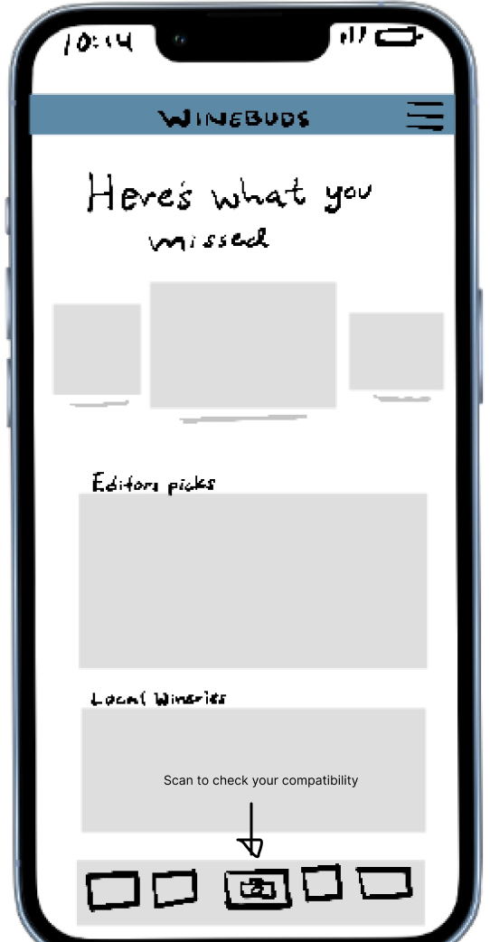
From our research and brainstorming what features to include, we narrowed it down to these basic components. We decided to start the user off with a brief questionnaire that will allow us to get to know the user and their preferences. Immediately after they will be presented with their top 10 wine suggestions. Users will be able to later re-take the questionnaire and see if their taste has changed their top 10 wine suggestions. In their home page they’ll see local events and editor’s picks. Our most exciting feature will be the ability for users to scan the barcode of a wine bottle and the WineBunds app will provide them with a % of compatibility.
Sketches


Wireframing


Key Learnings
user testing & iterations
Our goal was to understand how real users interact with our potential WineBuds app and make changes based on the results. We aimed for this app to be easy to navigate and its tasks can be completed with relative ease. We had users navigate to specific points of our app.

Iterations made
Moved Next Button on Results page to be more visible
Made Guide button more intuitive
Created a coaching screen to explain the wine scanning feature


final prototype


Once the user is done with onboarding, we move them into their home page that will include pages they can delve into talking about local wineries and events. If they wish to get more information or tips on wine, we have our “Guides” page that gives them a rundown on the topic. From our testing we went ahead and added a page that better explains what our scanning feature can do and how it works. On the last page we can see the option to see what pairs well with that wine. It’s a sneak peek of the the possibility of also suggesting what foods can pair best with that specific wine.


For the final design we wanted the user to not be intimated by our app so we stayed with lighter, more inviting colors. We wanted a more relaxed theme so we stayed with a palette of colors that represent the ocean and a sunset scene for our onboarding. As part of my random facts I know about animals, sea otters often hold each other in the water, they do so so they don’t drift apart from each other in the ocean. In a way I felt like that’s what we hope to do for our users, to support them in their journey to learn more about wine. Paola illustrated our logo along with our slogan “ Sip With Confidence” and I took lead designing.


Final Thoughts
WineBuds first began with the idea of creating a social app in which a user could potentially share their finds for wine and connect with other wine lovers. However, we learned that those (who wish to learn about wine) struggle finding a direction to head in terms of research and discovery. We made note of competitors and decided to stray away from the social app idea and focused more on the consumer's wine journey in their day-to-day supermarkets and restaurants.
Through user research and analysis, the outcome is an app that takes your personalized taste for wine and guides you, wherever you may be, through the use of a scanning feature and quick reference guides. Any future iterations will include the feature to also suggest different foods that pair best with the wine. That would also effect our questionnaire and seeing what meats or cheeses the user would prefer.