
Background
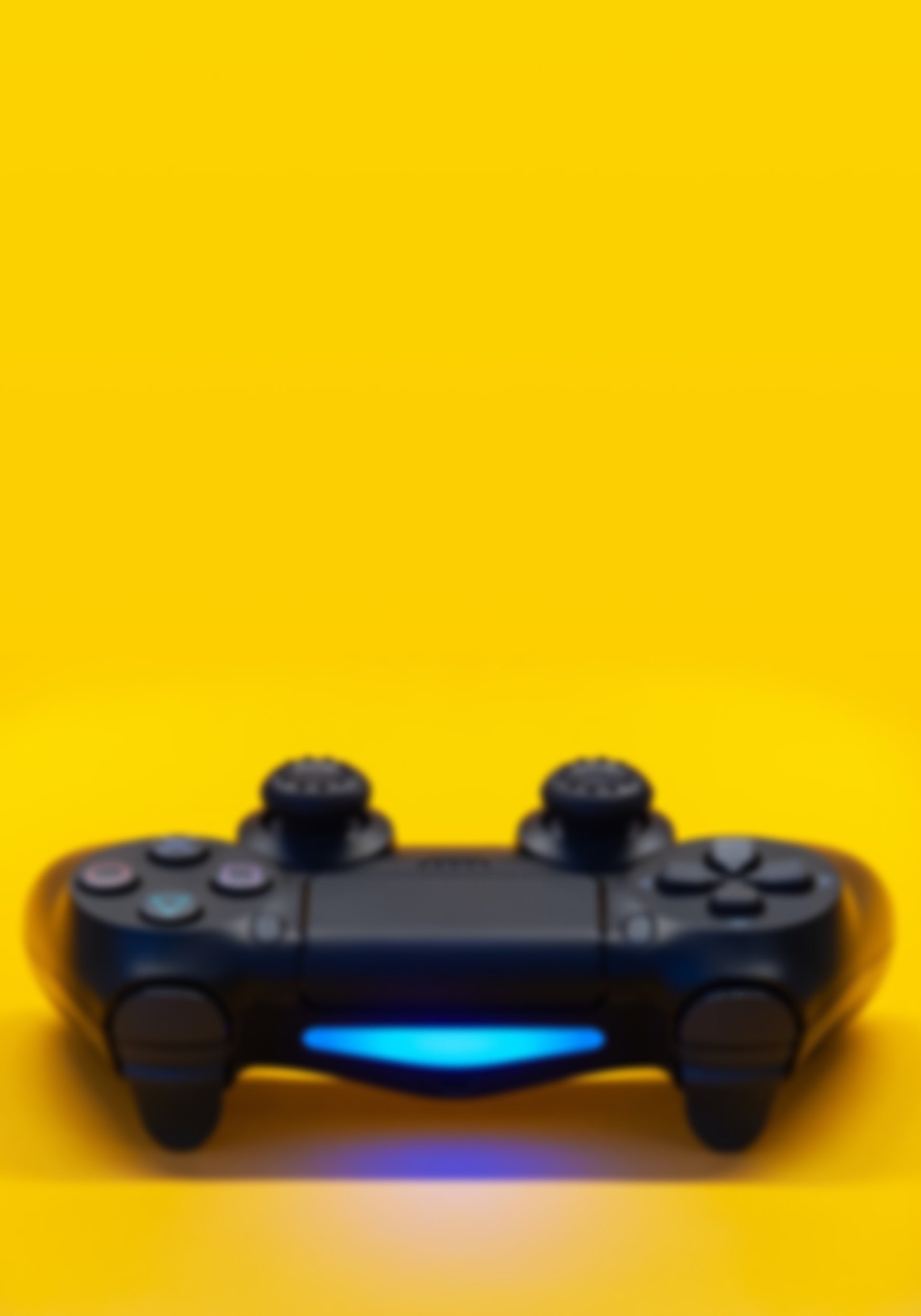
My team and I took the non-profit website of AbleGamers, they are an organization that helps people with disabilities obtain a gaming console that they would be able to use. We felt passionate about this non-profit organization and knew just from looking through their website that they would benefit from a re-design.
Roles
Ally- Project Manager, UX/UI Designer, User Research
Santos- User Research
Emily- User Research
Alyssa- UX Designer
Objectives
We want to focus on making sure the stories of the people they’ve helped is well represented on the home page instead of their sponsors.
We also want to condense some of the pages that don’t necessarily need to have a separate page.
Our goal was to inspire a community through gamer’s stories and design.
Span
3 Weeks with my team then an additional week after project ended to make additional iterations.


Competitor ANalysis
In our competitor analysis we decided to focus on two direct competitors, they are Gamer’s Outreach and Special Effect.
Gamer’s Outreach is a non-profit organization that provides entertainment to hospitalized families through video games. The organizations biggest selling point is their “GO Kart“ which is a portable video game kiosk that’s built for hospitals. Although their focus is only hospitals, they’ve been able to reach a bigger audience of potential donors.
Special effect is the United Kingdom’s version of AbleGamer’s. Special Effect has been able to help disabled gamers as well as children who battle with long term medical isolation. They created the “BubbleBuster” which is a small desktop robot that helps kids stay curious and focused on schoolwork.

With these incredible innovations from our competitors we understood we needed to work on focusing on the stories of the people AbleGamer’s has helped and update it’s design to add credibility as well.
User interviews
Our team conducted 7 interviews of people we knew are avid gamers. From these interviews we learned that 85% of them had never heard of AbleGamer’s and over half do actually donate to charities when they can. The few that had heard of AbleGamer’s got exposed to it from gaming influencers who outwardly supported the non-profit several years ago. The few that had visited the website before, noted that they visited the site wanting to see more about the people that AbleGamer’s had helped, which was not a main focus on the home page when they had visited the site. We knew AbleGamer’s did have that information available on their website, it was just not highlighted in the best place.
Problem statement
The Able Gamers is a non-profit organization created to tackle social isolation and cultivate an inclusive community for people with disabilities.
If providing a website that informs users and inspires a community, how might we create a more inviting layout and also add credibility to the website so we can gain more donations?


User flow


Previous design
To best present the final product, shown below are two examples of the original design from the website. On the left we show the original home page and to the right is the actual page for donating to AbleGamer’s
With this visual we are able to see how, although Ablegamer’s does focus in on their goals on the home page, there’s a slight disconnect of who this community actually is. As we learned in our user interviews, potential donors are wanting to know more about the people.

We did reach out to AbleGamer’s to possibly go over some issues we found that would be easy to fix like buttons not leading anywhere, unnecessary pages that could be condensed and the layout of the home page, but there was no response.


Final prototype

The actual donation page had to be a focus as well in the re-design. One thing I will always preach is to not overwhelm the user with too much information at once. Visually the donation page was not inviting, it felt like too much. I simplified the process and also made sure to add information I found on the site of how to still help the cause without having to donate money. It’s such a great thing that users are able to donate their gaming console to disabled gamers in need, I knew that was important to note on this page.
Starting with the homepage, one of the bigger issues I noticed was AbleGamer’s had all the right information a potential donor would want, it was just dispersed throughout different pages.
Having big name donors front and center does add credibility to an organization, but that was not the main focus for potential donors so I made sure to leave that towards the bottom of the page. Design wise I knew I wanted a different image since it looks like they re-use a lot of their images and I knew by adding the blue overlay it would add a professional, trustworthy feel to the non-profit website.

Final Thoughts
In this website re-design we focused on improving the donating experience and making sure users see the stories of people AbleGamers have helped. Looking forward we think it would be beneficial to look over the format they have for contacting them. On the website there's a questionnaire that needs to taken before trying to reach out, we would definitely want to update that portion so contacting them can be more accessible for everyone.