

background
The original Magma redesign idea came from one of my colleagues Cacie, who was already familiar with the website. They commented that they wish Magma (although they previously redesigned their brand) could redesign the most important part… the actual drawing page. In the mobile version specifically, the canvas was cluttered and left no room to actually collaborate and draw. It was covered by ads and the pull out tabs took up the entire screen. 4 colleagues of mine and I then began our work to best redesign this collaborative drawing space.
Roles
Objectives
Conduct research and testing to see how users who are experienced AND not experienced in art react to the interface of Magma.
Improve and optimize the mobile UI to best fit user needs.
Consider possibly updating the web experience with small optimizations that will go a long way in helping the user navigate the site.
Ally: UX/UI Designer, Prototyping, User Research
Lauren: User Research, UX/UI Designer, Prototyping, Project Manager
Matthew: User Research, UX Designer, Prototyping, Project Manager
Cacie: User Research and Testing, Illustration, FE Development
Emily: User Research, Coding
span
3 Weeks
User interviews
We conducted 5 user interviews to discover common trends among a small sample of digital artists, and their relationships with collaborative online drawing. Of those we tested, we found:
Users are already familiar with drawing programs & their functions
Users prefer simple UI; it makes the program more intuitive. They are also very tech-savvy


Users find it helpful and practical to have access to a mobile platform
competitor Analysis
For our competitor analysis, we looked at Drawpile and Procreate as our primary competitors, also Photoshop and Freeform as our indirect competitors.
Drawpile bears the most similar concept to Magma out of the four, but in order to use this program you first have to download it. After that, rooms must be hosted, or searched for and then joined.
This bulky process doesn’t hold a candle to the accessibility of Magma - joining a canvas is as simple as clicking a link, or clicking “New Drawing”.

User insight & problem statement
We observed that while Magma is ahead of the curve in terms of collaborative drawing applications, it’s behind other solo drawing programs and lacks many features that those have. Many users noted that especially for mobile, the program is somewhat cluttered and hard to use with a steeper than normal learning curve.
While we can’t change the engine or create new tools, we have decided to focus on improving the user interface, especially for the mobile web experience, in order to help magma better compete in the digital art space and bring users an easier and more enjoyable mobile experience.
How might we improve the user interface to make collaborating with Magma easier for digital artists, especially for those who use mobile?
UI Assessment


Sketches & wireframing

Our user testing plan consisted of three simple tasks that we hoped would give us insights into our design function, while also giving our testers the chance to learn and discover how the prototype works in their own ways.


Starting the design process, we knew we needed to find a way to condense all of the tools and paint brushes that Magma has to offer. We went back and forth from doing a pull up menu from the bottom compared to on the side. Ultimately we decided to have the quick menu pull out on the right hand side, due to the issue of the notch at the bottom for iPhone users. I started the overall concept design and then collaborated with Lauren to update the design with any additional input we got from our other project members.
User testing
We asked our testers to:
Navigate to the Dashboard
Customize the preset toolbar
Select a different layer
From our testing we learned that users struggled to close out of some tool menus, users easily switched between layers, they also found the iconography intuitive. Our prototype was too large, so much so that the users had to scroll down to access the second toolbar. With this data we went ahead and continued with our final prototype.
First Sketches
Wireframing
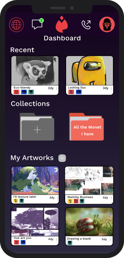
Final prototype


Moving into the actual canvas art space we chose to give the user the ability to select which basic tools they wish to keep on the bar on top. They have their menu including their layers, brushes and additional tools pull out from the bottom right. They will be able to alternate between 2 colors on the top right hand corner, and when selected, a color wheel pops up with their tool favorites. Compared to the previous design, these items are more well condensed and much more customizable.
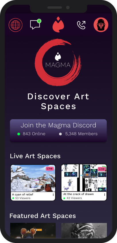
It was important to us to make sure this space could be used by anyone, not just the professionals. We found that Magma actually has a discord and featured live art spaces, but it was not advertised at all on the previous home page. The call and message option was only available within the actual drawing page so we gave them their own place on their navigation bar at the top. In the specific artwork pieces the user is able to see who is on their art space and when the last time was that anyone worked on it.


Final thoughts
Redesigning Magma was definitely one of my favorite case studies, I had a lot of fun with it and it shows with the dashboard I re-designed. My team and I had initial plans to re-design the web version as well and tried to, even attempted to code parts of it, but we quickly hit a wall trying to code a full working drawing program. It was a new experience from a regular website we typically would code. Overall I’m happy with the end product, for any future iterations, here’s a couple things we’d update:
We thought about finding a way to make the navigation bar maybe more hidden in order to make the most out of the already limited canvas space on mobile.
Making the tools window more interactive and getting the hot bar working would help to better visualize the UI we had in mind.
Making the web panels able to be dragged wherever the user wants to have it.
Create a less intrusive space for advertisements on the free version on both platforms